Have you ever thought about how different colors affect your mood? No? Don’t worry, you’re not alone. Most people don’t know about this, but the colors you see all around you in the brands of various small and medium-sized businesses are not there by chance.
Colors can greatly affect the way we feel and behave, and many people have been using them, from interior designers to digital marketers, in order to produce certain wanted effects for brands.
Let’s take, as an example, the color palette in the McDonald’s logo:
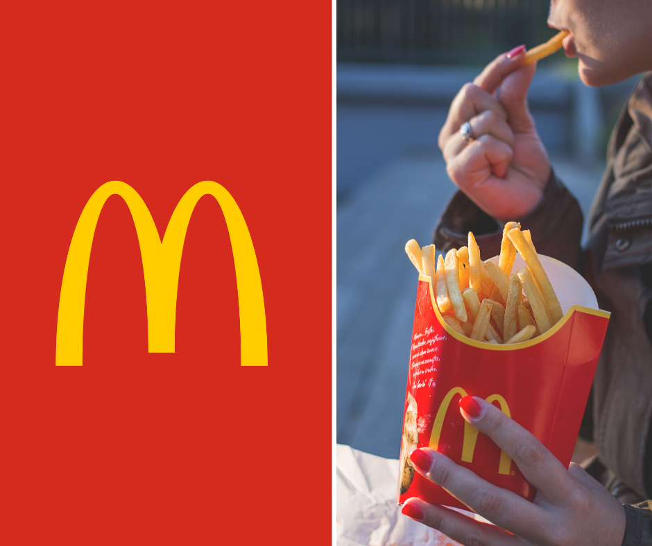
Red and yellow, as everyone knows. These colors have not been chosen by chance. Teams of marketers and researchers worked on this to come up with the best colors for the brand. This is all because both red and yellow are warm colors, and they are both associated with stimulation and activity. More importantly, red is a color that increases your heart rate, which actually jumpstarts your appetite (yes, believe it or not), and yellow is a color that’s usually associated with warm happy days, but it’s also easy to spot in daylight and at night, which is why it’s so easy to see a McDonald’s sign.
This means that, in logo design, for example, one of the most important steps designers take is choosing the perfect color or color palette. But, how do colors really influence our mood? Keep on reading to understand the psychology behind colors!
Colors Make Us Feel A Certain Way
Have you ever walked into a blue room and felt completely relaxed? Or into a red room and instantly felt a bit anxious? That’s because these colors play on our perception of the world, our heart rate, and our feelings and emotions. Just like words, colors are a strong and powerful communication tool that can be used for many purposes, from influencing someone’s moods and decisions to give you physiological reactions.
The Psychological Effect Of Colors
Colors are so powerful that they have real effects on our minds and bodies. From raising your blood pressure to making you feel content or enthusiastic, there is nothing colors can’t do. The question here, though, is why? And how?
Sure, color perception can be subjective, we all have preferences, but some colors affect us all the same, and there is nothing we can do about it. Notice how people wearing red suddenly look more attractive? Yes, that’s just one example of the effects of the color red on our brains.
Different colors evoke different emotions in the color spectrum. In the graphic below, the top area reflects warm color where red and orange tones echo warmth and optimism. For example: Red-orange logos in the below example exude friendliness, cheerfulness, and passion.
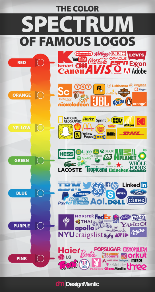
On the other end of the color spectrum in logo design, we have cool colors, the ones on the blue-purple side. Colors such as green, blue, and purple are part of cool and they tend to convey a feeling of calm, mother nature, and sophistication.
Tips On How To Use Color To Influence Buying Behavior
Now that we’ve talked about different colors and the influence they have on people; let’s talk about how you can use this color psychology to influence buying behavior of their target audience:
Use Red to Create a Sense of Urgency
Red is a color that excites the senses, raises appetite, heart rate and blood pressure and creates a sense of urgency. This is the reason why brands use red frequently in clearance sales, fast food restaurants, etc.
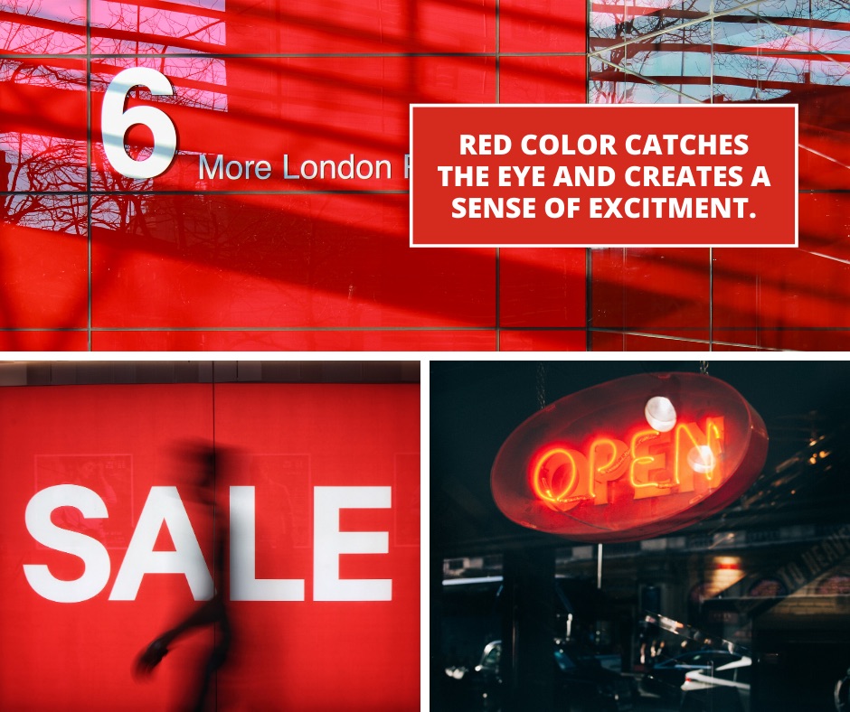
You can use red if you’re just starting out and announcing your new store’s opening; when you’re hosting a sale or if you’re a restaurant that wants to entice your hungry customers.
Use Green to Focus on Healing and Relaxation
As mentioned above, green creates harmony, relaxation and tranquility in people; therefore, if you’re a brand which focuses on healing, relaxation and tranquility, use green. An example here would be of Starbucks—even though they’re the coffee connoisseurs, instead of using red to encourage appetite, their logo features a mermaid in rich green color which evokes a sense of relaxation, warmth and calmness, which is what they want their customers to feel as they take a coffee break in their store during a hectic workday.
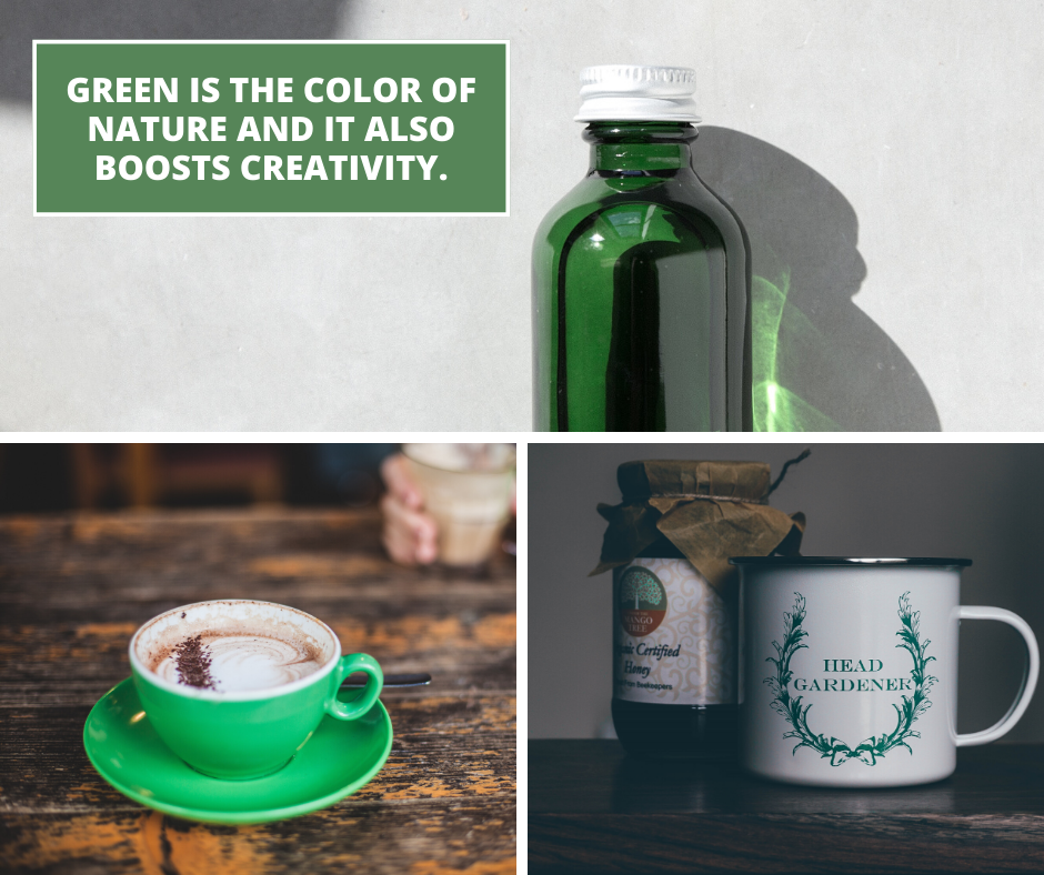
Therefore, if you’re a brand that wants their customers to have a relaxing shopping experience in your store, bringing a little foliage inside the room can make a huge difference.
Use Blue to Build Trust and Inspire Calm
If you’re a brand that wants to evoke trust and reliance in their customers, go for blue. Even having the walls of your store painted blue, or your website in hues of blue will benefit you.
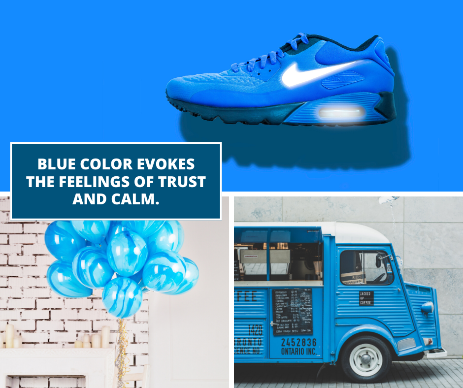
Moreover, since blue promotes productivity, having your designers, creators, writers or other employees working in a blue room will help in boosting their productivity.
Use Yellow and Orange for Drawing in Impulsive Buyers
Just like red, yellow and orange are also used for encouraging shoppers to buy from your store.
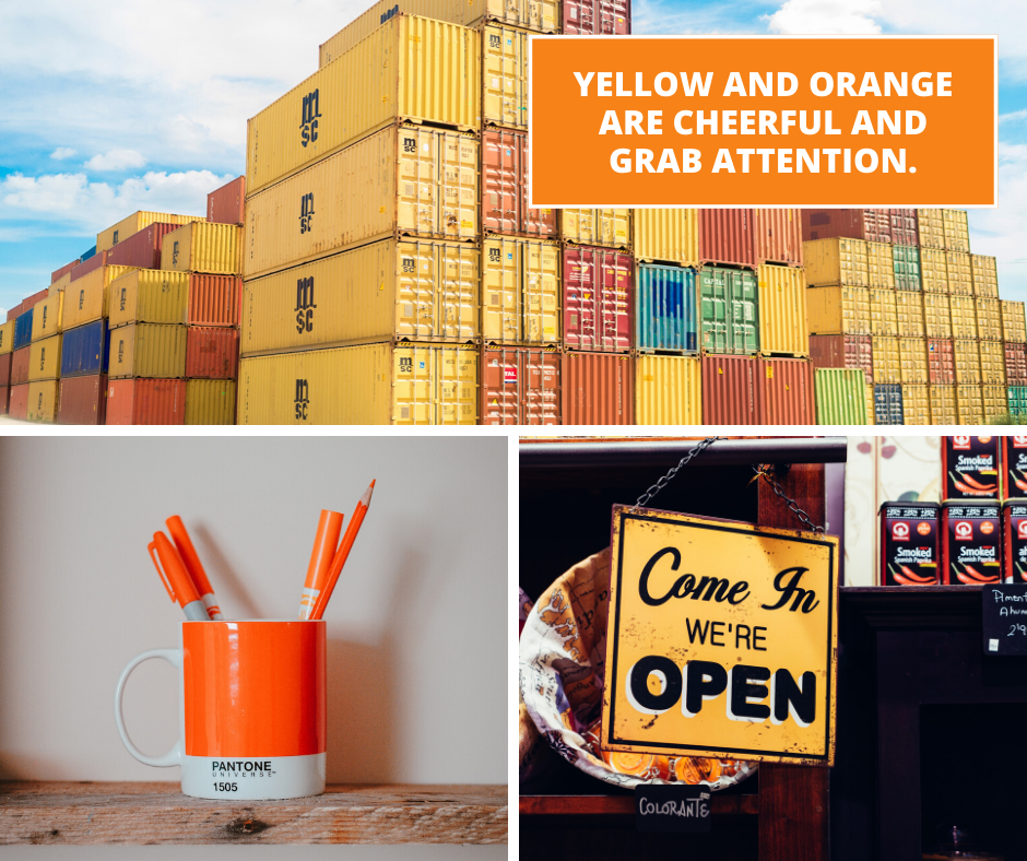
Yellow is also used in many fashion stores to evoke a sense of cheerfulness and optimism, hence, attracting customers.
Use Purple for promoting Lavish Beauty Brands
If you’re a beauty brand that targets women of all ages, different hues of purple will be beneficial for you. Moreover, luxury brands can also benefit from this color as it creates a sense of power and luxury.
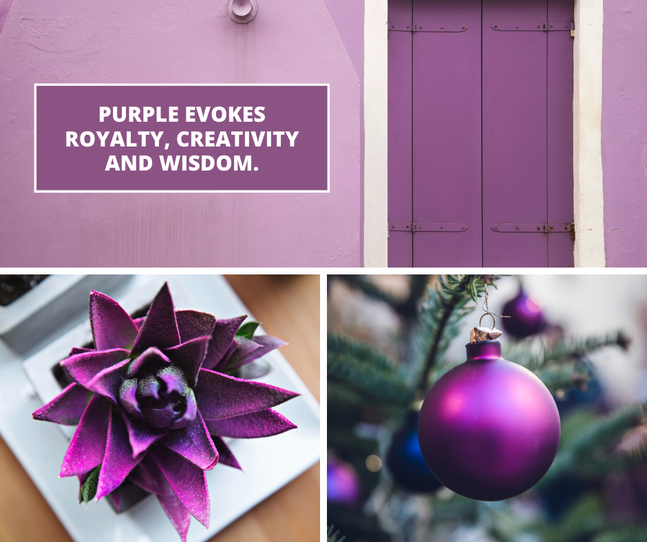
Purple—especially in pastel—is associated with nostalgia. Therefore, if your brand is bringing in designs or concepts from the past, you can use purple in pastel to evoke nostalgia in your customers.
Use Black to showcase Authority, Power and Luxury
Black—just like purple—is also used for showcasing power and luxury.
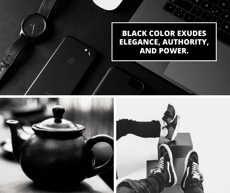
Therefore, if yours is a statement brand, use of black in your logo or other marketing elements with plenty of negative space will resonate with your brand and evoke feelings of authority and class.
Use White to Be Creative and Convey Originality
Do you own a yoga or design studio? Then white is the color for you!
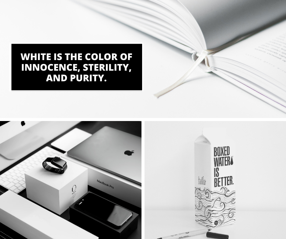
White is pure, clean and safe. Therefore, someone which showcases all these elements should use this color in their marketing elements. Moreover, if your business or the company you work for focuses on creativity, design, etc. using white can boost creativity as it is perceived as a clean and unaltered state.
Color psychology is one of the most interesting ones around, and it certainly explains a lot of our behavior. So, keep this in mind next time you’re hosting a sale or launching a new product because colors are an important factor that influences your audience’s buying behavior.
Have you ever given thought to how brands use colors to influence your behavior? Share your thoughts with us below!
from
https://addicted2success.com/success-advice/the-perfect-guide-to-show-how-colors-influence-your-audience/

No comments:
Post a Comment